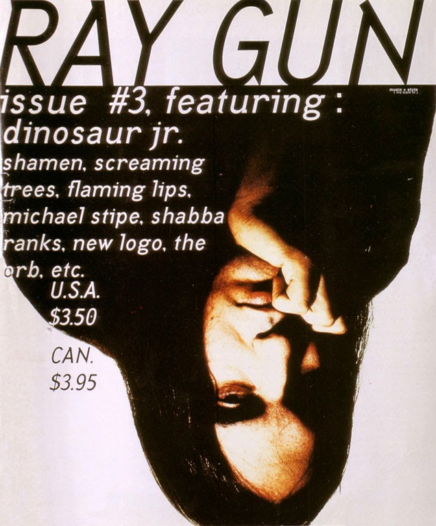
The magazine Raygun went against the tradition conventions of a magazine cover. In his own way he 'deconstruct' the covers of magazine and includes 'random' elements. The choice of fonts he uses makes the reader have a closer look into who is featuring in this magazine. This causes the magazine to stand out against the other stereotypical magazines however it could also confuse people into what they are reading.
 |
| This is a tradition magazine template for a film magazine. |
- The magazine is different and unique compared to the rest.
- Rules are made to be broken, he definitely broke the rules behind magazine conventions twice over
- His brave behaviour to do something new can encourage other magazine directors to push boundaries and be more adventurous
- It reflects the type of music it is representing. 'Alternative music must have a alternative magazine,right?'
- The layout and fonts makes it hard to understand
- Being alterative means there will be a smaller audience
- Could take longer to build a reputation as people make not understand the purpose or message behind the magazine
- The magazine causes people to take a closer look to develop a understanding and people may be against this as they want a easy pleasurable read
- There is no consistent layout which could make it harder for it's readers to find. Could even lead to readers giving up and not buying the magazine.
My opinion
I believe it is a positive thing there is a magazine which contradicts the conventions of a magazine. It reflects the alternative music genre by being a alternative magazine. It can inspire other magazines as well as aspiring designers to always push boundaries and step outside the box. It's hard to be inspired by a magazine which looks exactly the same to all the others on the shelf. However, it can be become unreadable with it's font choices and layout, making what should be a easy pleasurable read, hard work.


No comments:
Post a Comment